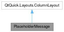
PlaceholderMessage

Public Types | |
| enum class | Type { Actionable , Informational } |
Properties | |
| string | explanation |
| alias | helpfulAction |
| alias | hoveredLink |
| PActionIconGroup | icon |
| string | text |
| int | type |
Signals | |
| void | linkActivated (string link) |
| void | linkHovered (string link) |
Detailed Description
A placeholder message indicating that a view is empty.
The message comprises a label with text, an optional explanation below the main text, an optional icon above all the text, and an optional button below all the text which can be used to easily show the user what to do next to add content to the view.
The explanatory text is selectable and can contain clickable links. In this latter case, client code must implement an onLinkactivated: signal handler or the links will not work.
The top-level component is a ColumnLayout, so additional components items can simply be added as child items and they will be positioned sanely.
Example usage:
- Since
- 2.12
Definition at line 119 of file PlaceholderMessage.qml.
Member Enumeration Documentation
◆ Type
|
strong |
Definition at line 121 of file PlaceholderMessage.qml.
Property Documentation
◆ explanation
|
read |
This property holds the smaller explanatory text to show below the larger title-style text.
Useful for providing a user-friendly explanation on how to proceed.
Optional; if not defined, the message will have no supplementary explanatory text.
- Since
- 5.80
Definition at line 158 of file PlaceholderMessage.qml.
◆ helpfulAction
|
read |
This property holds an action that helps the user proceed.
Typically used to guide the user to the next step for adding content or items to an empty view.
Optional; if undefined, no button will appear below the text label.
- Since
- 5.70
Definition at line 184 of file PlaceholderMessage.qml.
◆ hoveredLink
|
read |
This property holds the link embedded in the explanatory message text that the user is hovering over.
- Remarks
- This property is read-only
Definition at line 190 of file PlaceholderMessage.qml.
◆ icon
|
read |
This property provides an icon to display above the top text label.
- Note
- It accepts
icon.nameandicon.sourceto set the icon source. It is suggested to useicon.name.
Optional; if undefined, the message will have no icon. Falls back to undefined if the specified icon is not valid or cannot be loaded.
- See also
- org::kde::kirigami::private::ActionIconGroup
- Since
- 5.70
- Remarks
- This property is read-only
Definition at line 172 of file PlaceholderMessage.qml.
◆ text
|
read |
This property holds the text to show in the placeholder label.
Optional; if not defined, the message will have no large text label text. If both text: and explanation: are omitted, the message will have no text and only an icon, action button, and/or other custom content.
- Since
- 5.70
Definition at line 147 of file PlaceholderMessage.qml.
◆ type
|
read |
This property holds the PlaceholderMessage type.
The type of the message. This can be:
Kirigami.PlaceholderMessage.Type.Actionable: Makes it more attention-getting. Useful when the user is expected to interact with the message.Kirigami.PlaceholderMessage.Type.Informational: Makes it less prominent. Useful when the message in only informational.
default: if a helpfulAction is provided this will be of type Actionable otherwise of type Informational.
- Since
- 5.94
Definition at line 137 of file PlaceholderMessage.qml.
Member Function Documentation
◆ linkActivated
|
signal |
This signal is emitted when a link is clicked or tapped in the explanatory message text.
- Parameters
-
The clicked or tapped link.
◆ linkHovered
|
signal |
This signal is emitted when a link is hovered in the explanatory message text.
- Parameters
-
The hovered link.
The documentation for this class was generated from the following file:
Documentation copyright © 1996-2025 The KDE developers.
Generated on Fri Apr 4 2025 11:58:05 by doxygen 1.13.2 written by Dimitri van Heesch, © 1997-2006
KDE's Doxygen guidelines are available online.