BottomDrawer
BottomDrawer Class Reference
Properties | |
| alias | drawerContentItem |
| alias | headerContentItem |
Detailed Description
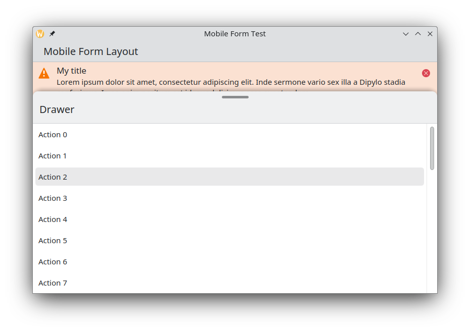
A bottom drawer component with a drag indicator.
Example:
import org.kde.kirigamiaddons.delegates 1.0 as Delegates
import org.kde.kirigamiaddons.components 1.0 as Components
Components.BottomDrawer {
id: drawer
headerContentItem: Kirigami.Heading {
text: "Drawer"
}
Delegates.RoundedItemDelegate {
text: "Action 1"
icon.name: "list-add"
onClicked: {
doSomething()
drawer.close()
}
}
Delegates.RoundedItemDelegate {
text: "Action 1"
icon.name: "list-add"
onClicked: {
doSomething()
drawer.close()
}
}
}
An item delegate providing a modern look and feel.
Definition RoundedItemDelegate.qml:14

- Since
- KirigamiAddons 0.12.0
Definition at line 47 of file BottomDrawer.qml.
Property Documentation
◆ drawerContentItem
|
read |
This property holds the content item of the drawer.
- Remarks
- This is the default property
Definition at line 53 of file BottomDrawer.qml.
◆ headerContentItem
|
read |
This property holds the content item of the drawer header.
when no headerContentItem is set, the header will not be displayed
Definition at line 59 of file BottomDrawer.qml.
The documentation for this class was generated from the following file:
This file is part of the KDE documentation.
Documentation copyright © 1996-2025 The KDE developers.
Generated on Fri Apr 25 2025 11:53:15 by doxygen 1.13.2 written by Dimitri van Heesch, © 1997-2006
Documentation copyright © 1996-2025 The KDE developers.
Generated on Fri Apr 25 2025 11:53:15 by doxygen 1.13.2 written by Dimitri van Heesch, © 1997-2006
KDE's Doxygen guidelines are available online.