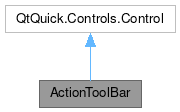
ActionToolBar

Properties | |
| alias | actions |
| alias | alignment |
| int | display |
| bool | flat |
| alias | heightMode |
| alias | maximumContentWidth |
| string | overflowIconName |
| int | position |
| alias | visibleWidth |
Detailed Description
A toolbar built out of a list of actions.
The default representation for visible actions is a QtQuick.Controls.ToolButton, but it can be changed by setting the Action.displayComponent for an action. The default behavior of ActionToolBar is to display as many actions as possible, placing those that will not fit into an overflow menu. This can be changed by setting the displayHint property on an Action. For example, when setting the DisplayHint.KeepVisible display hint, ActionToolBar will try to keep that action in view as long as possible, using an icon-only button if a button with text does not fit.
- Since
- 2.5
Definition at line 27 of file ActionToolBar.qml.
Property Documentation
◆ actions
|
read |
This property holds a list of visible actions.
- Remarks
- This property is read-only
The ActionToolBar will try to display as many actions as possible. Those that won't fit will go into an overflow menu.
Definition at line 39 of file ActionToolBar.qml.
◆ alignment
|
read |
This property holds the alignment of the buttons.
When there is more space available than required by the visible delegates, we need to determine how to place the delegates.
When there is more space available than required by the visible action delegates, we need to determine where to position them.
default: Qt.AlignLeft
- See also
- Qt::AlignmentFlag
Definition at line 75 of file ActionToolBar.qml.
◆ display
|
read |
This property determines how the icon and text are displayed within the button.
Permitted values are:
Button.IconOnlyButton.TextOnlyButton.TextBesideIconButton.TextUnderIcon
default: Controls.Button.TextBesideIcon
- See also
- QtQuick.Controls.AbstractButton
Definition at line 60 of file ActionToolBar.qml.
◆ flat
|
read |
This property holds whether the buttons will have a flat appearance.
default: true
Definition at line 45 of file ActionToolBar.qml.
◆ heightMode
|
read |
This property sets the handling method for items that do not match the toolbar's height.
When toolbar items do not match the height of the toolbar, there are several ways we can deal with this. This property sets the preferred way.
Permitted values are:
HeightMode.AlwaysCenterHeightMode.AlwaysFillAlwaysFill.ConstrainIfLarger
default: HeightMode::ConstrainIfLarger
Definition at line 132 of file ActionToolBar.qml.
◆ maximumContentWidth
|
read |
This property holds the maximum width of the content of this ToolBar.
- Remarks
- This property is read-only
If the toolbar's width is larger than this value, empty space will be added on the sides, according to the Alignment property.
The value of this property is derived from the ToolBar's actions and their properties.
Definition at line 99 of file ActionToolBar.qml.
◆ overflowIconName
|
read |
This property holds the name of the icon to use for the overflow menu button.
default: "overflow-menu"
- Since
- 5.65
- 2.12
Definition at line 108 of file ActionToolBar.qml.
◆ position
|
read |
This property holds the position of the toolbar.
If this ActionToolBar is the contentItem of a QQC2 Toolbar, the position is bound to the ToolBar's position
Permitted values are:
ToolBar.Header: The toolbar is at the top, as a window or page header.ToolBar.Footer: The toolbar is at the bottom, as a window or page footer.
Definition at line 87 of file ActionToolBar.qml.
◆ visibleWidth
|
read |
This property holds the combined width of all visible delegates.
- Remarks
- This property is read-only
Definition at line 114 of file ActionToolBar.qml.
The documentation for this class was generated from the following file:
Documentation copyright © 1996-2025 The KDE developers.
Generated on Fri Apr 11 2025 11:49:27 by doxygen 1.13.2 written by Dimitri van Heesch, © 1997-2006
KDE's Doxygen guidelines are available online.